What is Digital Accessibility
Completion requirements
5. What content needs to be updated?
5.1. Word document
Here are some suggestions to make your word document or text based content accessible:
- Make sure your text content is flexible e.g. the font, font size and colours can be changed by the user.
- Make sure colour contrasts work well in the document and you are not using colour to emphasise your point.
- Font size is minimum 12 on reading documents, and sans-serif fonts are used, e.g. Arial, Calibri, Helvetica, not serif fonts such as: Times, Times New Roman, Courier.
- Appropriate titles, headings and structure is used by defining author, title, headings, lists, headers/footers, columns, line and paragraph spacing, word wrapping (around inserted objects) where applicable.
- Make sure your links are text-based Hyperlinks. E.g. use 'Wikipedia', not Wikipedia: Click here or https://en.wikipedia.org/wiki/Main_Page.
- Pictures, charts or diagrams have ALT text (Guidance on ALT text) with an explanation in words underneath images, pictures and charts.
- Tables are formatted for accessibility, e.g. you have provided headers and reading order. Link to video on using tables.
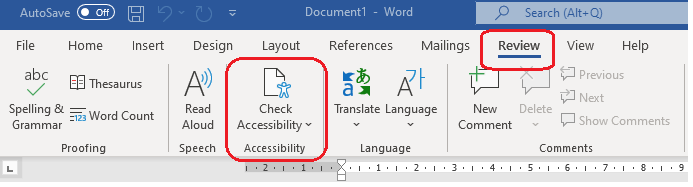
Microsoft Word also has it's own Accessibility Checker which is very useful. Depending on which version of Word you are using, you can either find this via the Review menu:
Or if you are using an older version of Word, this can be found by clicking File > Inspect Document > Check Accessibility.